Explanation of Project
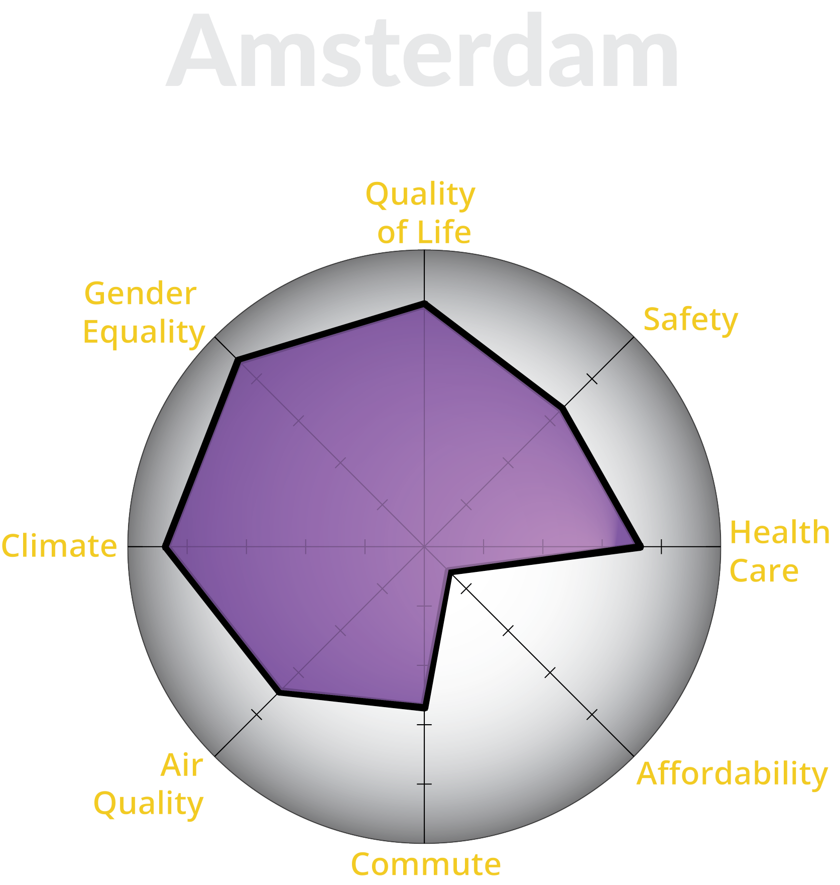
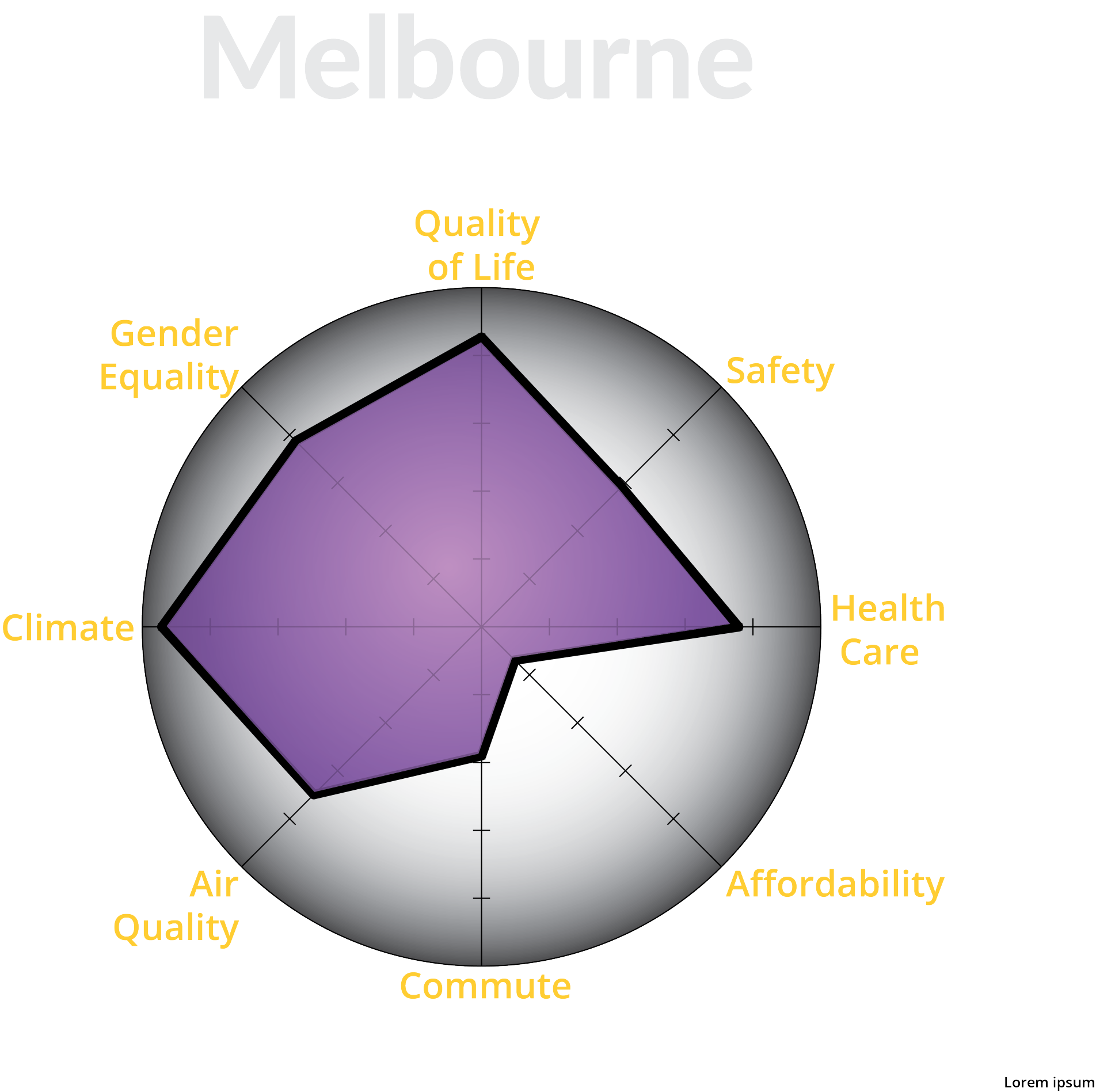
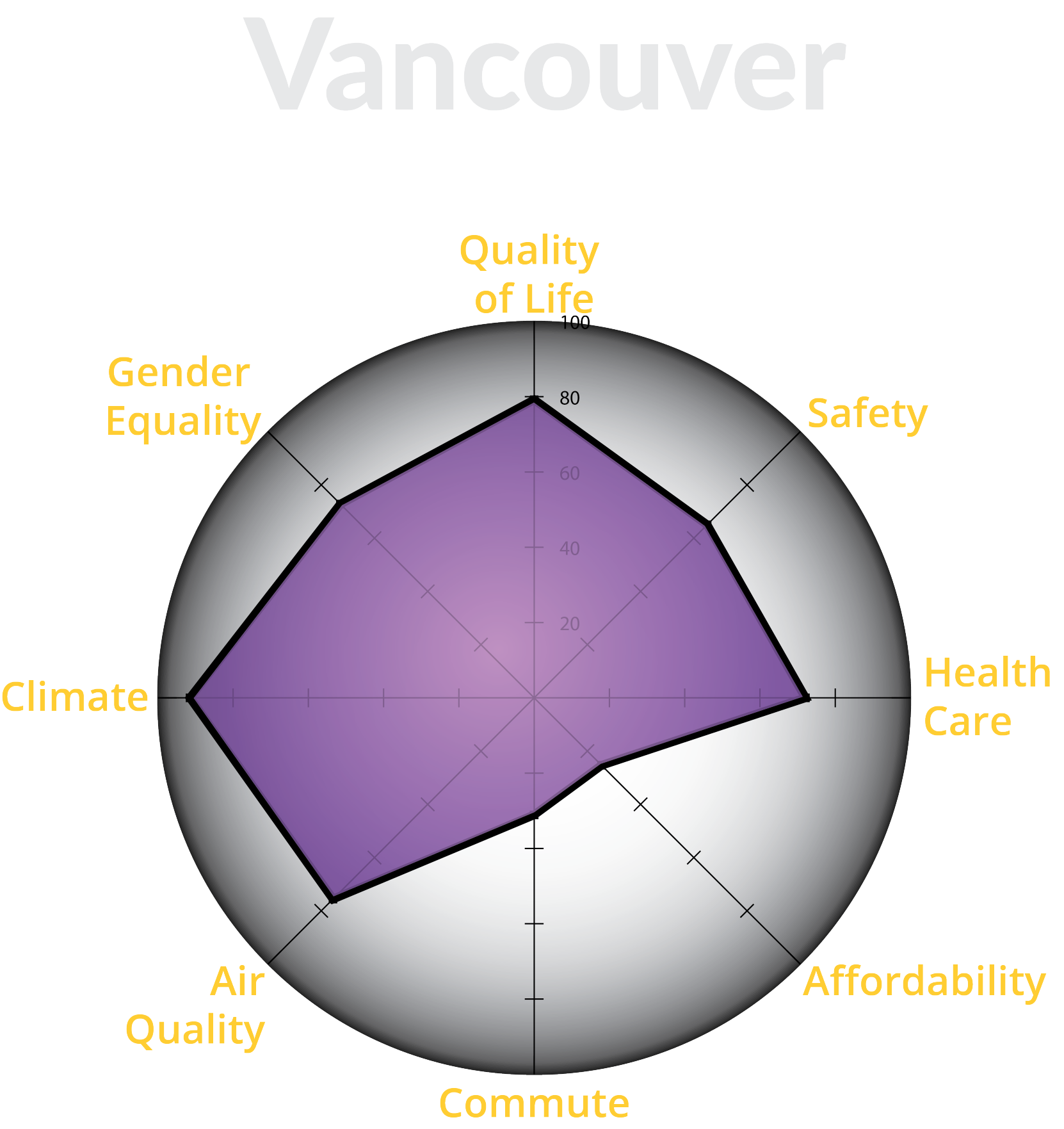
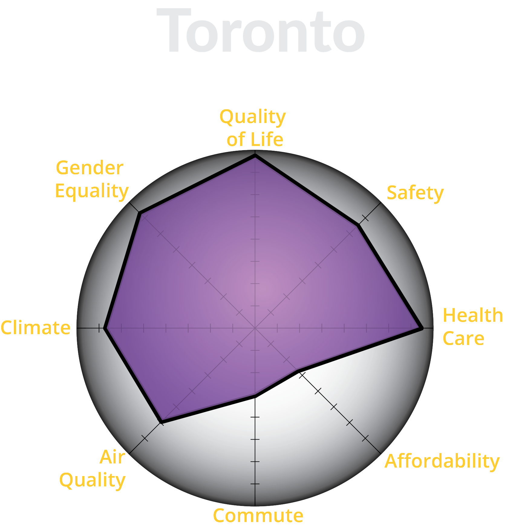
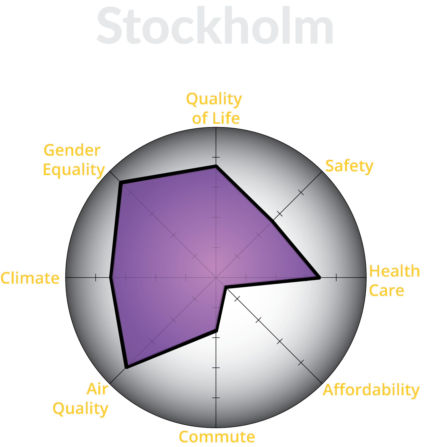
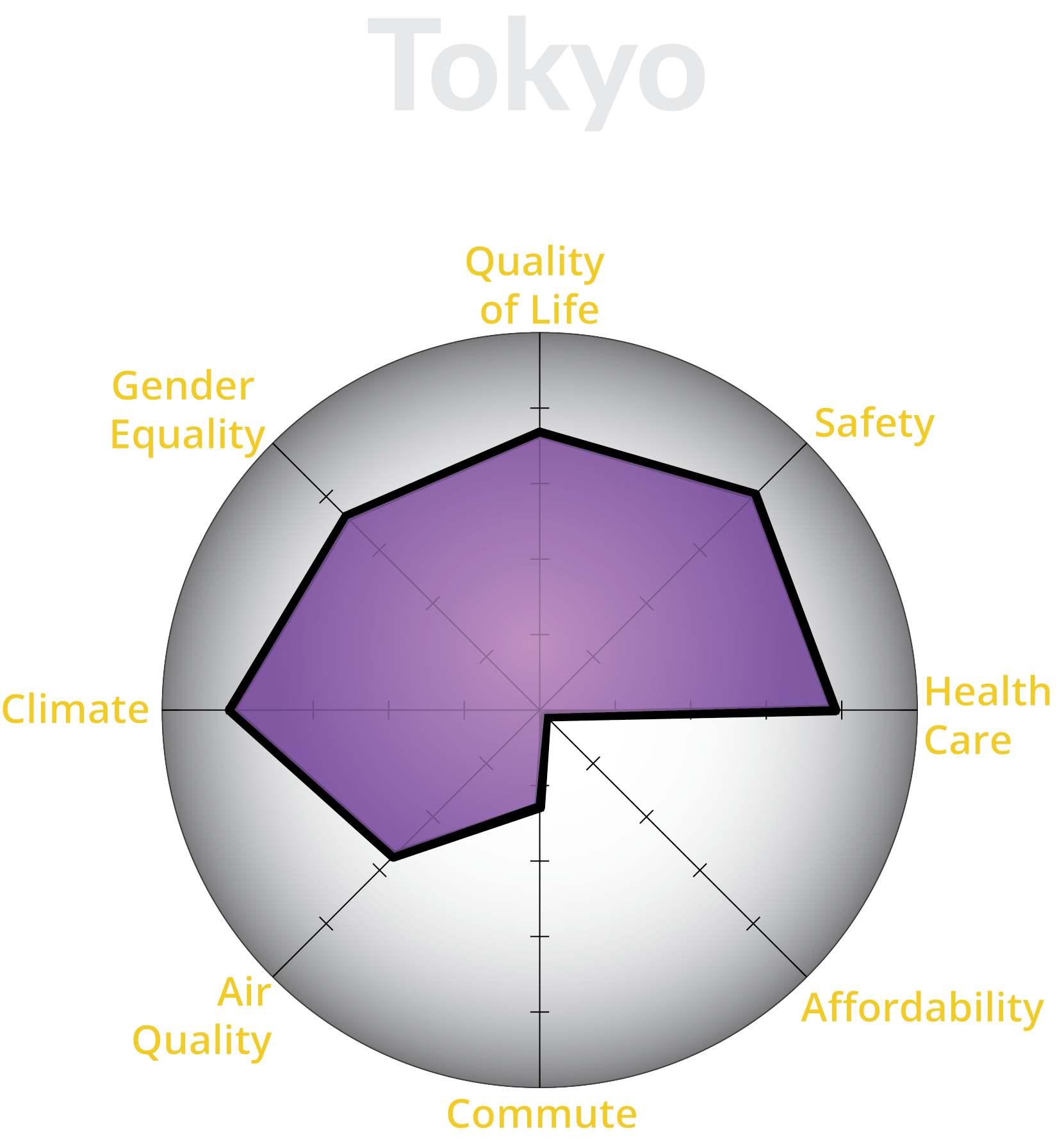
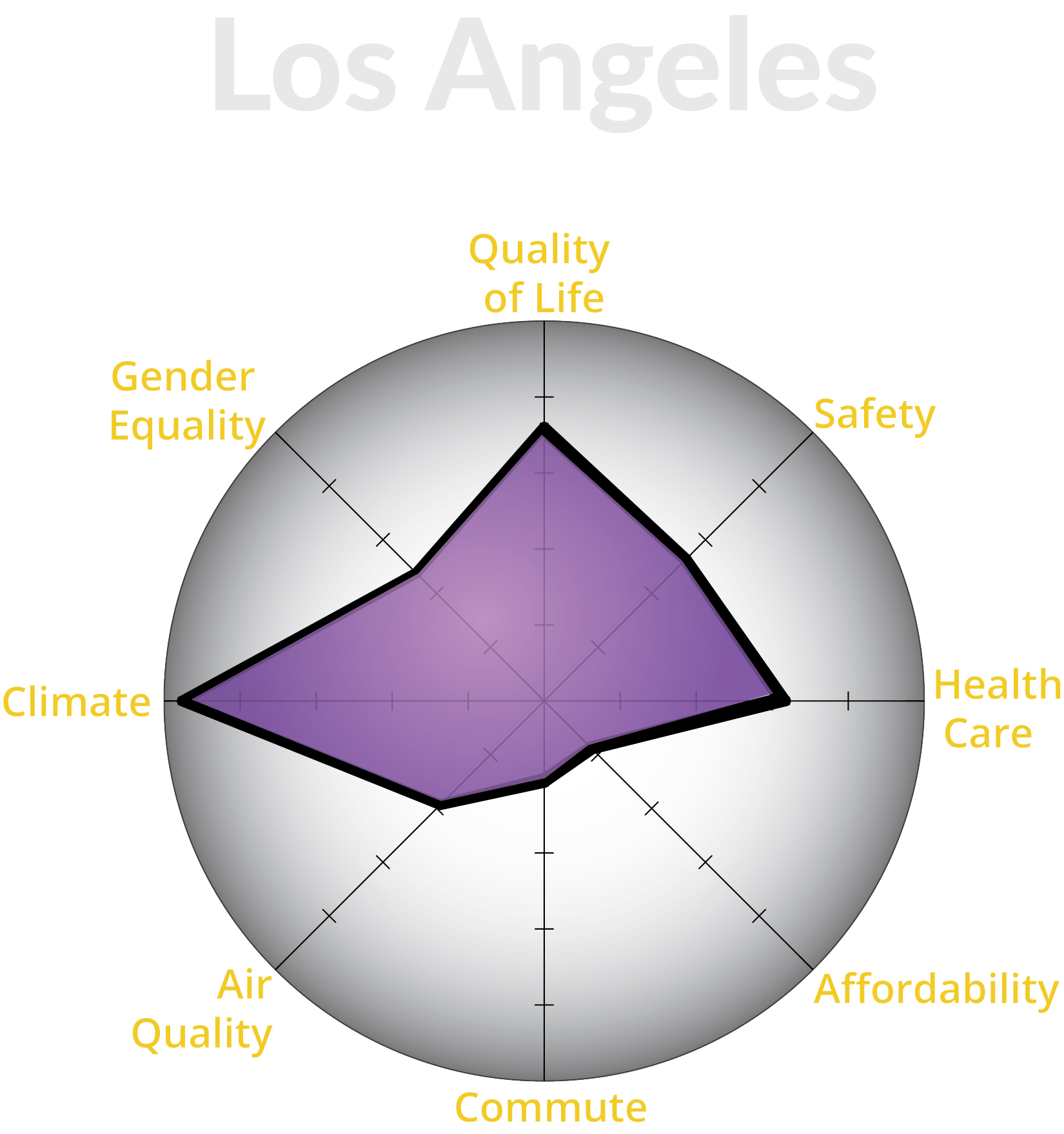
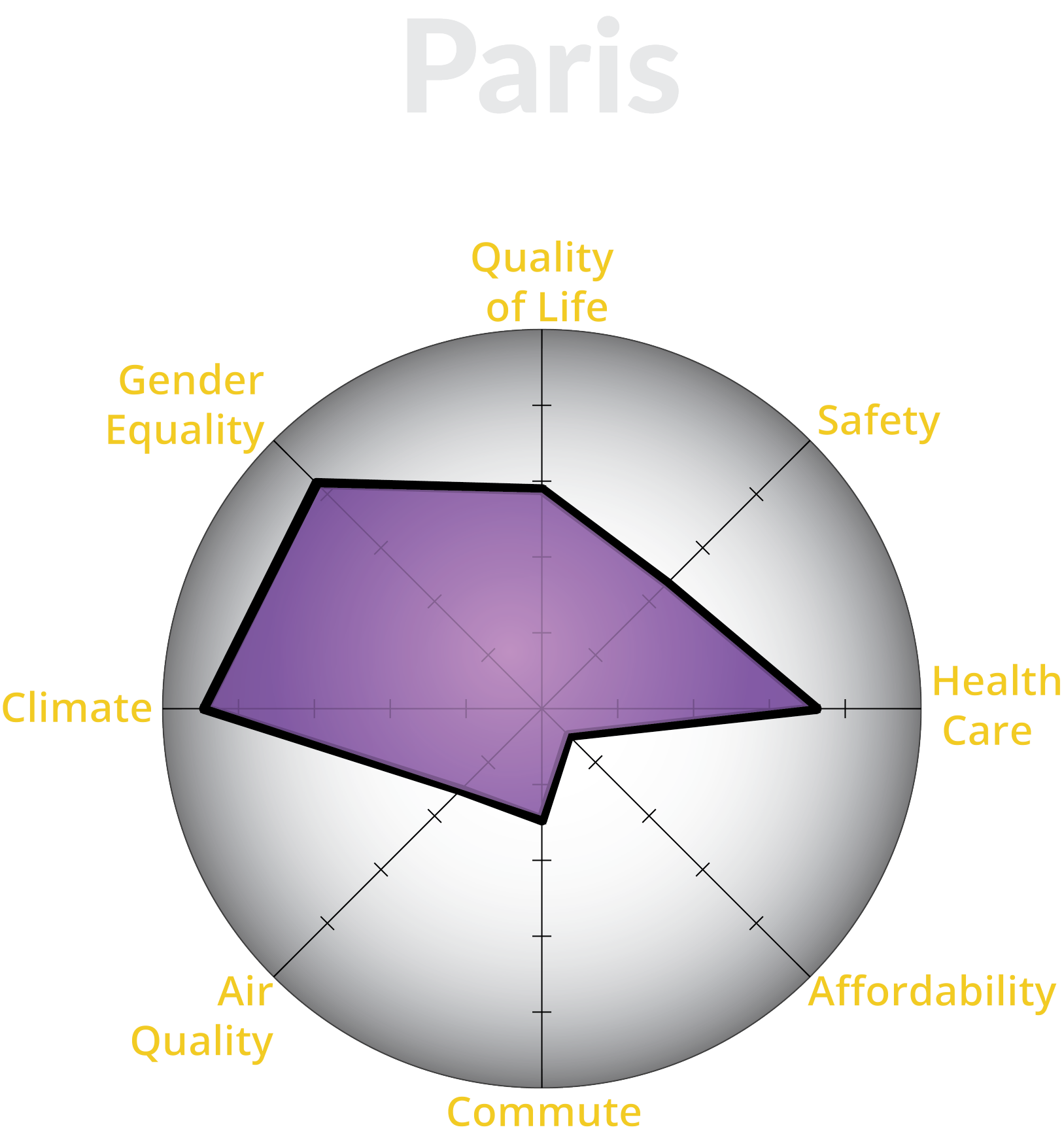
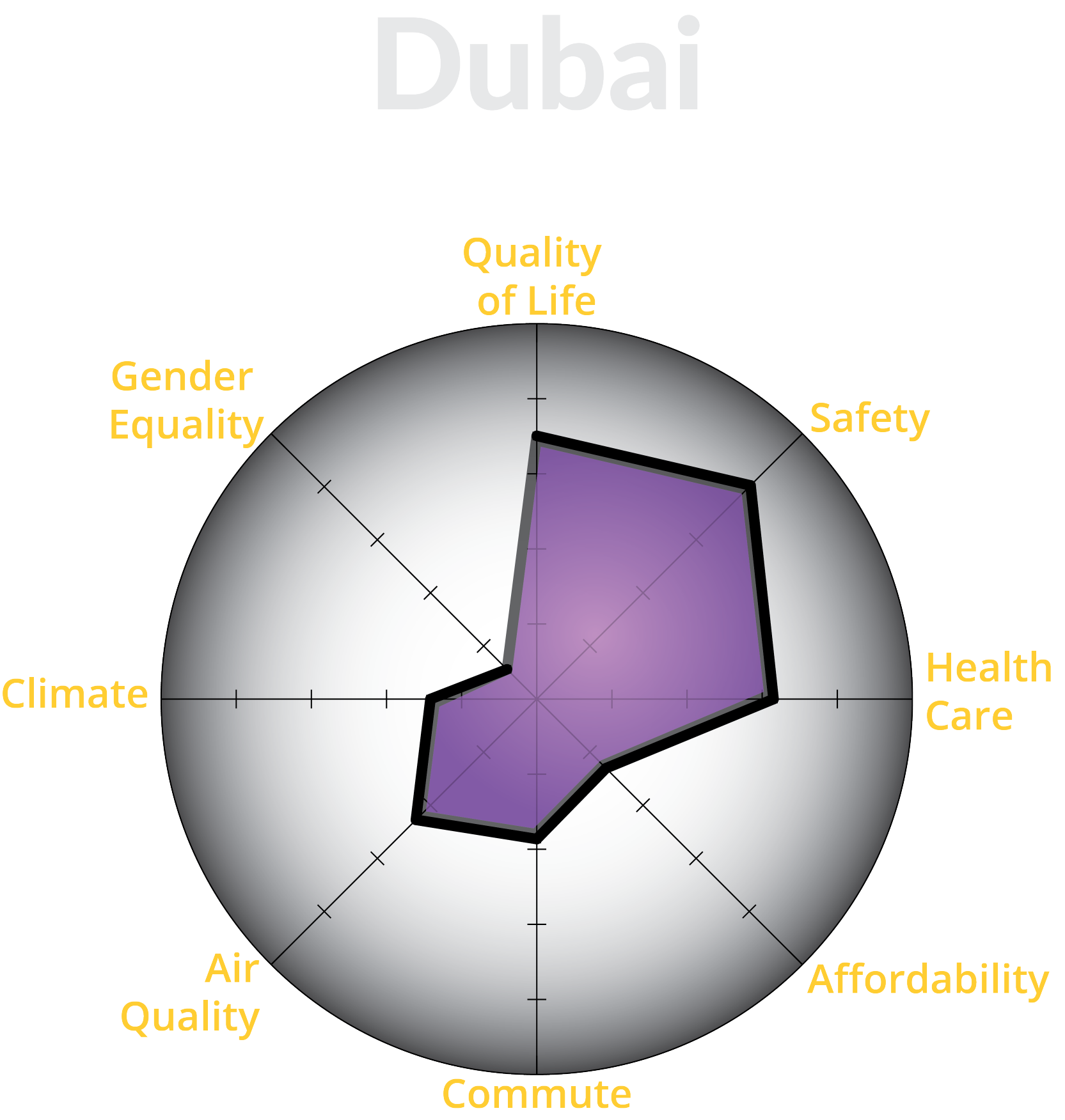
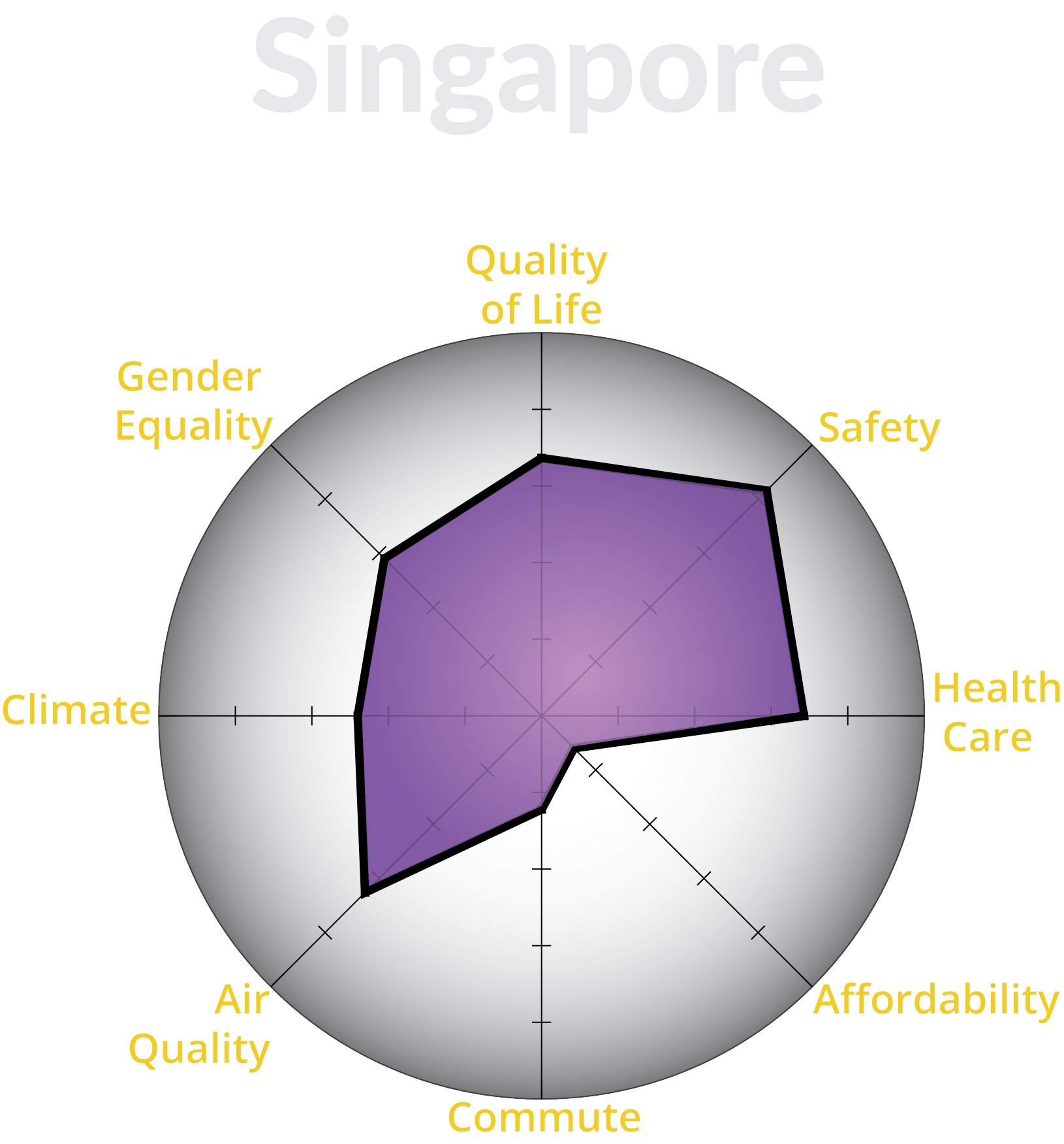
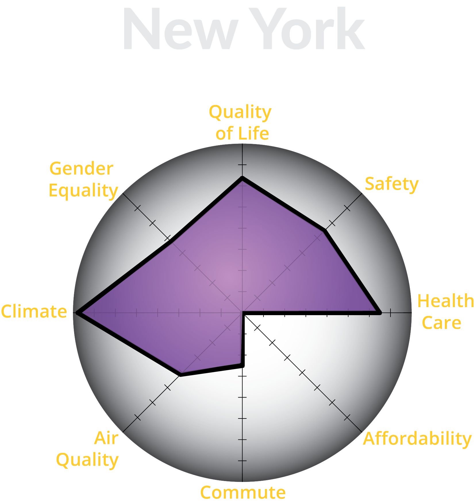
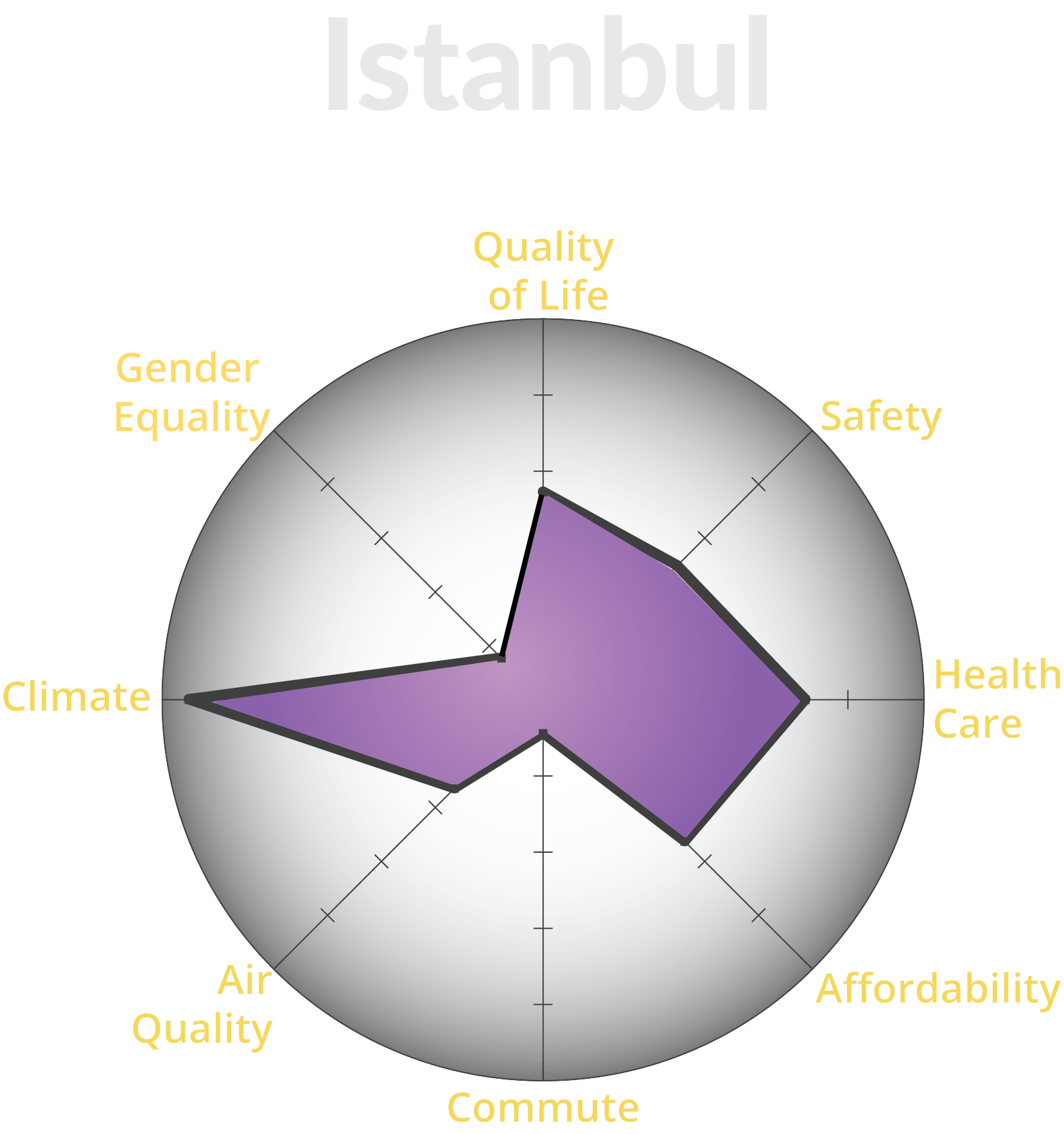
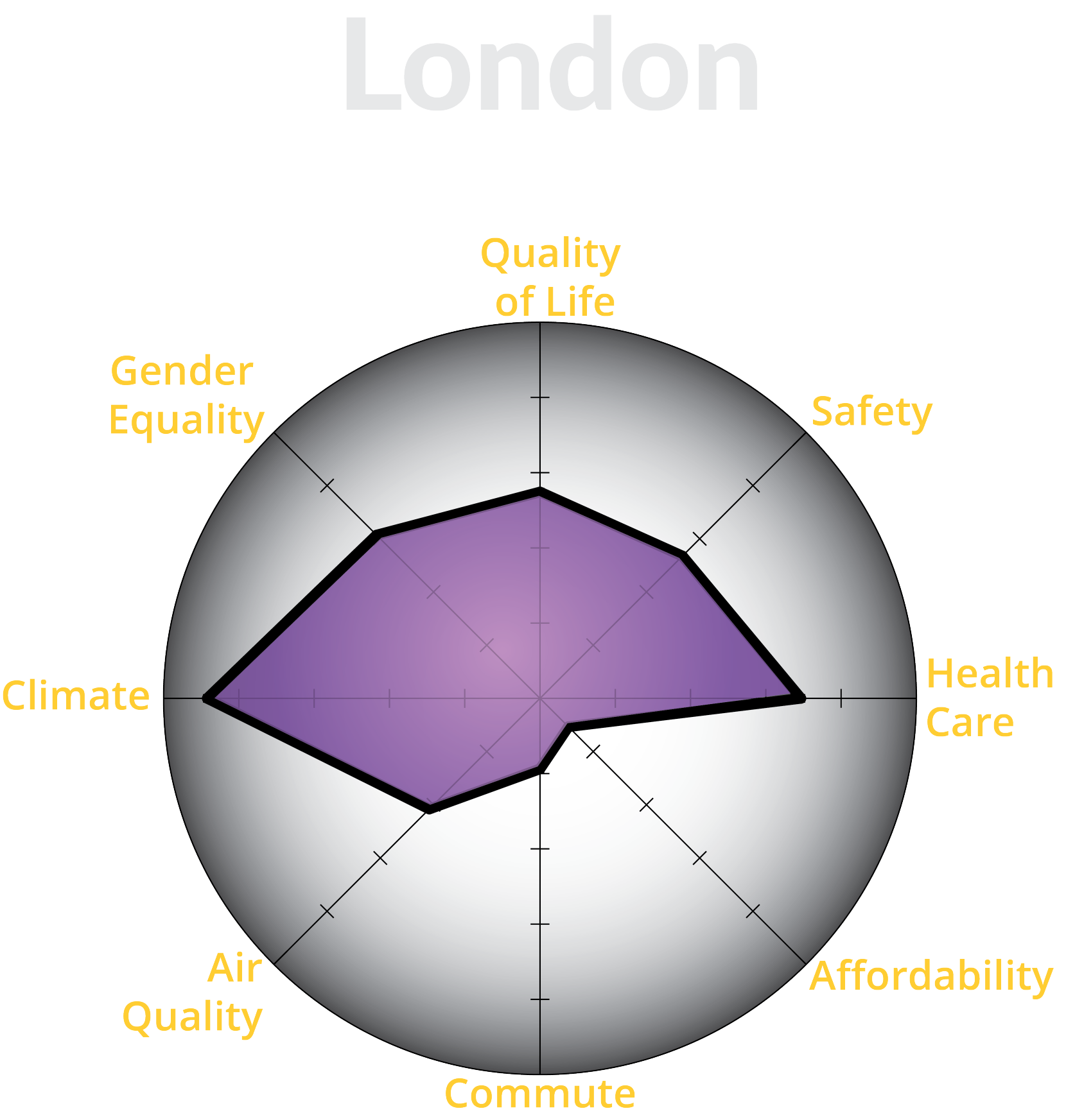
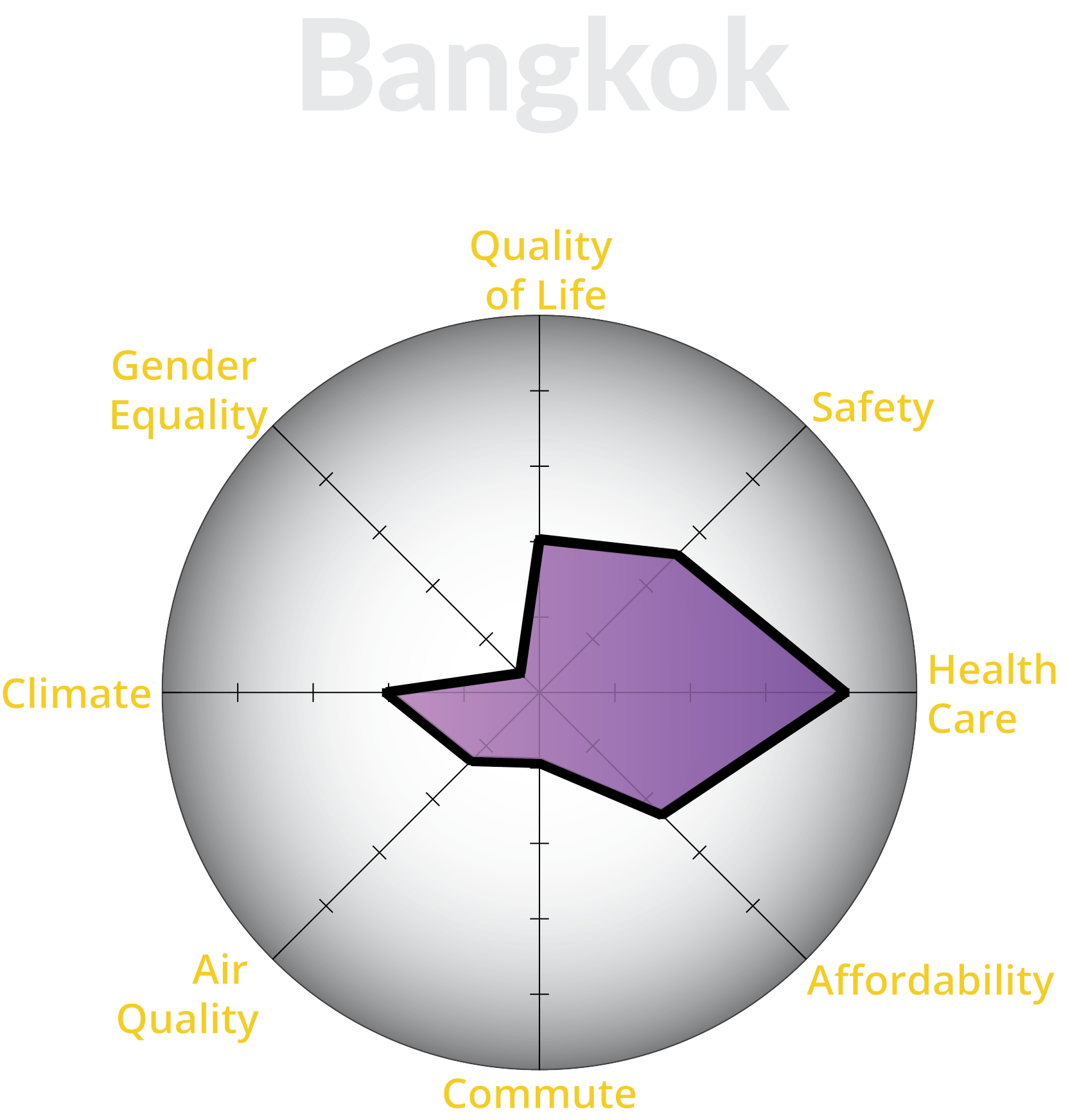
This project visualizes city quality of life indeces to help the user decide and choose the world's best city. Fourteen cities were selected for this project based on three popular top ten lists: Conde Nast Traveler’s Top Ten Most Popular cities, Economist Intelligence Unit’s (EIU) Top Ten Livable Cities, and Pricewaterhouse Cooper’s Top Ten Cities of Opportunities. Once selected, eight indeces from Numbeo’s Quality of Life Quarterly Report and the United Nations were used to create radar graphs for each city. An example of the radar graph is on the right. To better understand and compare the data, the indeces were normalized from 1 to 100. High scores (closer to the edge of the circle) indicates higher quality of life. To enter the site, click on the enter button below.